
Undertow CIC
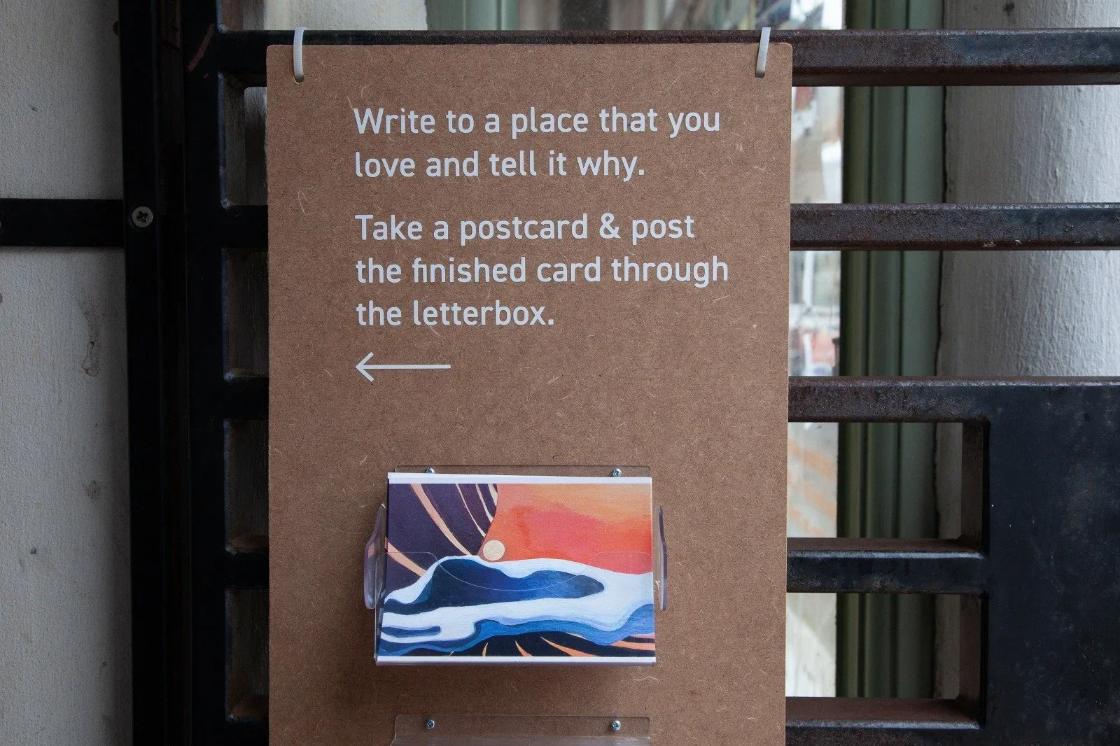
Undertow is a Margate-based organisation using the power of storytelling to support mental health, wellbeing, and recovery - particularly among vulnerable and marginalised groups. Their work creates transformative, creative sessions for communities including refugees, migrants, survivors of domestic violence, and individuals who have experienced homelessness. When they approached Pansy Studios, they needed more than a website: they needed a digital identity that reflected their trauma-informed, community-centred ethos.
"Ellen doesn't just say she's excellent; she is," I found myself thinking again this morning, a familiar refrain. Her sharp judgment isn't just a trait; it's a superpower.
Over the past two years, seeing Ellen in action across diverse projects through Pansy Studios has been nothing short of revelatory. She doesn't just contribute; she elevates. Think meticulous execution, a mind that crackles with encyclopedic knowledge base, all fuelled by a work ethic that redefines 'relentless’.
“But this powerhouse is also genuinely kind, deeply thoughtful - a unicorn in the professional landscape. She possesses that rare alchemy of a wildly creative spirit channeled through a ruthlessly logical core. Her adaptability is off the charts.
Bottom line? If you have the chance to bring Ellen on board, seize it. For any role, in any arena, my recommendation isn't just wholehearted; it's a resounding, unequivocal yes.”
- Dr Kat Lewis, Founder of Undertow
how did we revolutionise this org?
We began with a full creative and strategic refresh - shaping a brand that could hold space for sensitivity, resilience, and radical care. The new website is clean, content-led, and fully accessible, offering intuitive navigation for users while retaining a soft, open visual feel. Designed to evolve alongside their programmes, it serves both as an archive and a platform for connection.
Alongside the web build, we developed Undertow’s tone of voice - one rooted in trust, care, and clarity. Their work is deeply emotional and often delicate, so it was important to find language that felt grounded and empowering, without becoming overly clinical or performative. This tone is now carried across the entire site and communications, creating consistency and approachability at every touchpoint.
For the visual identity, we leaned into the metaphor of the undertow - the quiet pull beneath the surface, a force that can destabilise but also reveal. Monochrome colour palettes, pared-back design, and moments of typographic disruption reflect this duality: strength and softness, disruption and recovery.
The aesthetic gently disrupts expectations of how “community” or “support” work is typically branded - aligning with Undertow’s commitment to doing things differently.
Since launch, Undertow has used the new platform to reach new audiences, host events, and grow a meaningful presence in and beyond Margate.
With a unified barand and voice, they are better equipped to amplify the stories that matter, strengthen community bonds, and use storytelling as a powerful tool for healing and change.